LogoLogo
SearchService PortalKnowledge BaseOthersDeutschRequest support
  • Welcome
  • Elements of the storefront
    • Header
    • Footer
    • Category pages
    • Product pages
  • Additional features
    • CMS extensions
      • CMS blocks
        • Hero slider
          • Hero slider (2x)
          • Hero slider (3x)
          • Hero slider (4x)
        • Teaser
        • Banner
        • Columns
          • One column
          • Two columns
          • Two columns (swapped on phones)
          • Two columns, 3-9
          • Two columns, 4-8
          • Two columns, 5-7
          • Two columns, 7-5
          • Two columns, 8-4
          • Two columns, 9-3
          • Three columns
          • Three columns, 2-2-8
          • Three columns, 2-8-2
          • Three columns, 3-3-6
          • Three columns, 3-6-3
          • Three columns, 6-3-3
          • Three columns, 8-2-2
          • Four columns
          • Five columns
          • Six columns
          • Six columns (Custom)
        • Grids
          • Grid 'Modern'
          • Grid 'Modern' (swapped)
          • Grid 'One'
          • Grid 'One' (swapped)
          • Grid 'Two'
          • Grid 'Two' (swapped)
          • Grid 'Three'
          • Grid 'Three' (swapped)
          • Grid 'Four'
          • Grid 'Four' (swapped)
          • Grid 'Five'
          • Grid 'Five' (swapped)
          • Grid 'Six'
          • Grid 'Six' (swapped)
        • Text & images
          • Image & text layered
        • Listing page
        • Product page
          • Product name (without manufacturer logo)
          • Image gallery and buy box (with product name)
          • Image gallery and buy box (with product name & manufacturer logo)
          • Product description & reviews (Accordion)
        • Sidebar
          • Subcategory navigation (Sidebar)
        • Sale
          • Hero countdown
          • Countdown banner
          • Countdown banner (compact)
          • Discount banner
        • Other
          • Breadcrumb navigation
          • Testimonial (Customer review)
          • Testimonials (Four columns)
          • Custom code (HTML/CSS/JS)
      • CMS elements
        • Hero slider
          • Call-to-Action slide (Hero slider)
          • Text slide (Hero slider)
          • Image slide (Hero slider)
        • Teaser
          • Text teaser
          • Text teaser (decorated)
          • Button teaser
          • Call-to-Action
          • Hover box
          • Image teaser
          • Hero teaser
          • Advanced teaser
          • Classic teaser
          • Modern teaser
          • Round teaser
        • Banner
          • Image banner
          • Parallax banner
          • Hero banner
          • Advanced banner
        • Text & images
          • Image & text layered
        • Listing page
          • Listing subcategories
          • Listing subcategories (Modern)
        • Product page
          • Image gallery (Grid)
          • Product description & reviews (Accordion)
        • Sidebar
          • Subcategory navigation
        • Sale
          • Hero countdown (Heading)
          • Countdown banner
          • Countdown banner (compact)
          • Discount banner
        • Other
          • Breadcrumb navigation
          • Testimonial (Customer review)
          • Custom code (HTML/CSS/JS)
    • Custom fields
      • Categories
        • Body class
        • Columns per row
        • Hero section
        • Highlight category
        • Listing subcategories
        • Shopping Experiences Header
      • Products
        • General
          • Benefits
          • Comment
          • Custom field 1
          • Custom field 2
          • Custom field 3
          • Custom tab – Text
          • Custom tab – Title
          • Hover image
          • Short description
        • Datasheets
          • Datasheets (Text)
          • Datasheet 1
          • Datasheet 1 – Title
          • Datasheet 2
          • Datasheet 2 – Title
          • Datasheet 3
          • Datasheet 3 – Title
        • Downloads
          • Download 1
          • Download 1 – Title
          • Download 1 – Description
          • Download 2
          • Download 2 – Title
          • Download 2 – Description
          • Download 3
          • Download 3 – Title
          • Download 3 – Description
        • Further links
          • Further link 1
          • Further link 1 – Title
          • Further link 1 – Open link in a new tab
          • Further link 2
          • Further link 2 – Title
          • Further link 2 – Open link in a new tab
          • Further link 3
          • Further link 3 – Title
          • Further link 3 – Open link in a new tab
        • Videos
          • Product videos (Text)
          • Video 1
          • Video 1 – Title
          • Video 2
          • Video 2 – Title
          • Video 3
          • Video 3 – Title
          • YouTube video(s)
          • Vimeo video(s)
    • Extensions
      • Announcement banner
      • Benefits on product pages
      • Checkout steps
      • Custom announcement
      • Floating widget
      • Hero section
      • Highlight category
      • Labels on product pages
        • Delivery time label
        • Free shipping label
        • Not available label
        • Pre-order label
        • Sold label
        • Stock label
      • Listing subcategories
      • Manufacturer in listings
      • Payment methods on product pages
      • Product badges
        • Discount badge
        • Free shipping badge
        • New badge
        • Sold badge
        • Stock badge
        • Topseller badge
      • Product datasheets
      • Product downloads
      • Product number in listings
      • Product short description
      • Product specifications
      • Product videos
      • Quickview
      • Sharing links
      • Shopping Experiences Header
      • Slideout communities
      • Social media links (icons)
      • Social proofing
        • Sales infotext
      • Tabs on product pages
        • Custom tab
        • Datasheets tab
        • Manufacturer tab
        • Properties tab
        • Videos tab
      • USP bar
    • Media
      • Flag icons
      • Payment method logos
      • Shipping method logos
      • Shopping Experiences
      • Social icons
    • Widgets
      • About us
      • Awards, seals or certificates
      • Benefits
      • Communities or social media
      • Custom text
      • Footer navigation
      • Location or retail store
      • Newsletter
      • Payment and shipping methods
      • Payment logos
      • Service hotline
      • Shipping logos
  • More knowledge
    • Google Fonts
    • JavaScript plugins
    • Payment methods
    • Shipping methods
    • Snippets
  • Configuration
    • Layout
      • Main colours
        • Configuration
      • Status messages
        • Configuration
      • Typography
        • Configuration
      • E-Commerce
        • Configuration
      • Media
        • Configuration
      • Layout
        • Configuration
      • Buttons
        • Configuration
      • Forms
        • Configuration
      • Modals
        • Configuration
      • Product rating
        • Configuration
      • Tables
        • Configuration
    • Header
      • Layout
        • Configuration
      • Logo
        • Configuration
      • Top bar
        • Configuration
      • Search
        • Configuration
      • Action buttons
        • Configuration
      • Top navigation
        • Configuration
      • Top navigation flyout
        • Configuration
      • Sticky top navigation (Basic headers "Header 1" and "Header 2")
        • Configuration
      • Minimal header (in the Checkout)
        • Configuration
      • Mobile header
        • Configuration
      • Shopping Experiences Header
        • Configuration
    • Footer
      • Layout
        • Configuration
      • Upper section
        • Configuration
      • Main section
        • Configuration
      • Lower section
        • Configuration
      • Assigning and arranging content
        • Configuration
      • Minimal footer (in the Checkout)
        • Configuration
      • Logos footer
        • Configuration
      • Copyright footer
        • Configuration
    • Content
      • Breadcrumb
        • Configuration
      • Cookie permission
        • Configuration
      • Offcanvas navigation
        • Configuration
      • Pagination
        • Configuration
      • Product badges
        • Configuration
      • Scroll up button
        • Configuration
      • Sliders
        • Configuration
    • Shopping Experiences
      • All types (Shop pages, Landing pages, Listing pages, Product pages)
        • Configuration
      • Image slider (Category "Images")
        • Configuration
      • Image gallery (Category "Images")
        • Configuration
      • Two columns, boxed image & text (Category "Text & images")
        • Configuration
      • Product slider (Category "Commerce")
        • Configuration
      • Product filter (Category "Sidebar")
        • Configuration
      • Category navigation (Category "Sidebar")
        • Configuration
    • Listing pages
      • Layout (Layout type "Standard")
        • Configuration
      • Layout (Layout type "Big image")
        • Configuration
      • Layout (Layout type "Minimal content")
        • Configuration
      • Product badges (in the product box)
        • Configuration
      • Product box
        • Configuration
      • Product box (Layout type "Standard")
        • Configuration
      • Product box (Layout type "Big image")
        • Configuration
      • Product box (Layout type "Minimal content")
        • Configuration
    • Product pages
      • Layout
        • Configuration
      • Image gallery
        • Configuration
      • Buybox
        • Configuration
      • Delivery information labels (in the buybox)
        • Configuration
      • Product badges (in the image gallery or buybox)
        • Configuration
      • Product specifications (in the buybox)
        • Configuration
      • Product videos (in tabs)
        • Configuration
      • Social proofing (in the buybox)
        • Configuration
      • Sharing links (in the buybox)
        • Configuration
      • Benefits (in the buybox)
        • Configuration
      • Payment logos (in the buybox)
        • Configuration
      • Tabs
        • Configuration
      • Tab "Description"
        • Configuration
      • Tab "Properties"
        • Configuration
      • Tab "Product videos"
        • Configuration
      • Tab "Datasheets"
        • Configuration
      • Tab "Custom content"
        • Configuration
      • Tab "Manufacturer"
        • Configuration
      • Cross Selling
        • Configuration
    • Pages
      • General
        • Configuration
      • Login
        • Configuration
      • My account
        • Configuration
      • Checkout
        • Configuration
    • Sidebar
      • Layout
        • Configuration
      • Sidebar widgets
        • Configuration
      • Sidebar widgets (Headlines)
        • Configuration
      • Sidebar widgets: Assigning and arranging content
        • Configuration
    • Widgets
      • Footer navigation
        • Configuration
      • Awards, seals or certificates
        • Configuration
      • Benefits
        • Configuration
      • Communities or social media
        • Configuration
      • Service hotline
        • Configuration
      • Location or retail store
        • Configuration
      • Newsletter
        • Configuration
      • Payment logos
        • Configuration
      • Shipping logos
        • Configuration
    • Extensions
      • Announcement banner (in the header)
        • Configuration
      • Checkout steps
        • Configuration
      • Custom announcement (on product pages and in the checkout)
        • Configuration
      • Floating widget
        • Configuration
      • Hero section (on listing pages)
        • Configuration
      • Listing subcategories (on listing pages)
        • Configuration
      • Slideout communities
        • Configuration
      • USP bar
        • Configuration
    • Others
      • Advanced settings
        • Configuration
      • Expert settings
        • Configuration
      • Compatibility (HC-Architecture®)
        • Configuration
      • Beta
        • Configuration
      • Deprecated
        • Configuration
  • Miscellaneous
    • About ThemeWare®
    • ThemeWare® Demoshops
    • ThemeWare® Knowledge base
    • ThemeWare® Video Tutorial
    • ThemeWare® Utilities
    • 🇩🇪Deutsch
Powered by GitBook
LogoLogo

ThemeWare®

  • About ThemeWare®
  • ThemeWare® Demoshops
  • ThemeWare® Service Portal
  • ThemeWare® Utilities

Informations

  • Legal notice
  • Newsletter
  • Privacy
  • Support

© 2024 by ThemeWare® | Made with 💙 by TC-Innovations GmbH

On this page
  • Configure element
  • Configuration
  • General
  • Layout
  • Responsive
  • Slide
  • SEO & Pagespeed
  • Advanced
  • Breakpoint
  • Image
  • Text
  • Demo

Was this helpful?

  1. Additional features
  2. CMS extensions
  3. CMS elements
  4. Hero slider

Call-to-Action slide (Hero slider)

PreviousHero sliderNextText slide (Hero slider)

Last updated 7 months ago

Was this helpful?

Note: This article is work in progress.

The ThemeWare® CMS element "Call-to-Action slide (Hero slider)" is explicitly intended for use in the CMS block "Hero slider (...)". The CMS element is not designed for use in other CMS blocks and does not work in other CMS blocks.

Note: The element is explicitly intended for use in its own CMS block. It is not designed for use in other CMS blocks and therefore cannot be exchanged or placed in other blocks.

Important: This element is only available in the ThemeWare® Pro Edition.


Configure element

You can configure the ThemeWare® CMS element "Call-to-Action slide (Hero slider)" as follows:

  1. Click on the corresponding CMS block (1) to activate the "edit mode"

  2. Navigate to the desired CMS element using the arrow navigation (2)

  3. The "Element settings" pop-up will open

  4. Make the desired changes

  5. Save your changes

You have now configured the CMS element.


Configuration

The configuration of the "Call-to-Action slide" is quite self-explanatory. The image, the text and the button text are mandatory fields. That's all you really need to configure.

General

In the tab "General" you configure the content of the element.

Image

In the section "Image" you define the background image (1) of the slide. This is a mandatory field.

Content

In the section "Content" you can enter the teaser text (3), the headline (4), the text (5) and the button text (6) for the slide. The text and the button text are mandatory fields.

Link

In the section "Link" you define the target of the teaser when it is clicked.

Note: The text area is HTML-capable. However, links <a> should not be used if the configuration "Entire element clickable" is used, as this interferes with the actual linking of the slide.

Layout

In the tab "Layout" you can configure the overlay (2), the text (3, 4, 5) in the overlay, the button (6) and a coloured overlay.

Content

In the section "Content" you configure the text alignment and the text shadow.

Teaser

In the section "Teaser" you can configure the font and text colour for the teaser (3).

Headline

In the section "Headline" you can configure the font and text colour for the headline (4).

Text

In the section "Text" you can configure the font and text colour for the text (5).

Button

In the section "Button" you can configure the button style (the colour) and determine whether the button (6) should be filled or represented as an outline button.

Content overlay

In the section "Content overlay" you configure the overlay (2). Here you can configure the horizontal alignment and the vertical alignment of the overlay. You can also select a fade-in animation and set the width (e.g. 100%) and the maximum width (e.g. 50%) for the overlay.

With the configuration "Apply overlay styling" you can activate configuration fields for styling the overlay. Here you can set the background colour, select a box shadow and rounded corners.

Colour overlay

In the section "Colour overlay" a colour overlay can be activated and configured.

Note: Please note that the theme variables are not available in the administration. The button colour of the preview is replaced by the corresponding theme colour in the storefront.

Responsive

In the tab "Responsive" you can optimise the representation for mobile viewports. Here you can configure breakpoints for the image display mode and the text overlay.

Image

In the section "Image" you can configure the display mode of the image. With the breakpoint you can define when the display mode of the image should change (e.g. from 'cover' to 'contain'). In this way you can, for example, guarantee a minimum height in mobile viewports.

Text

In the section "Text" the breakpoint for the text can be configured. From this breakpoint on, the text overlays the image.

Slide

...

SEO & Pagespeed

In the tab "SEO & Pagespeed" you can configure the HTML tag for the headline and the "Lazy loading" of the image.

Advanced

You can select each HTML element of our slides using the appropriate CSS classes. If you want to use your own CSS classes, you can insert them in the "Advanced" tab.


Breakpoint

Image

The image of the Hero slides is usually displayed in display mode 'contain' (1). It scales, while maintaining the aspect ratio, to the full width of the slide.

Since ThemeWare® 2.1 you have the option of defining yourself whether the display mode should change to 'cover' (2) and if so, from which viewport. In the display mode 'cover' you must also configure the minimum height (3) of the slide. This determines the height of the slide and the image fills the slide while maintaining its aspect ratio. If necessary, the image is cropped (4) to fit.

Text

The text in the Hero slides usually overlays the image. In smaller viewports, this may no longer fit perfectly, especially with long texts, so the text is displayed below the image on mobile devices.

Since ThemeWare® 2.1 you have the option to define yourself whether the text should be displayed on top of the image, and if so, from which viewport.


Demo

You can find some examples of use in our demo shops:

Click on the "gear" icon (3) to configure the CMS element

Hero sliderDemostore
ThemeWare® Demoshop => Hero slider
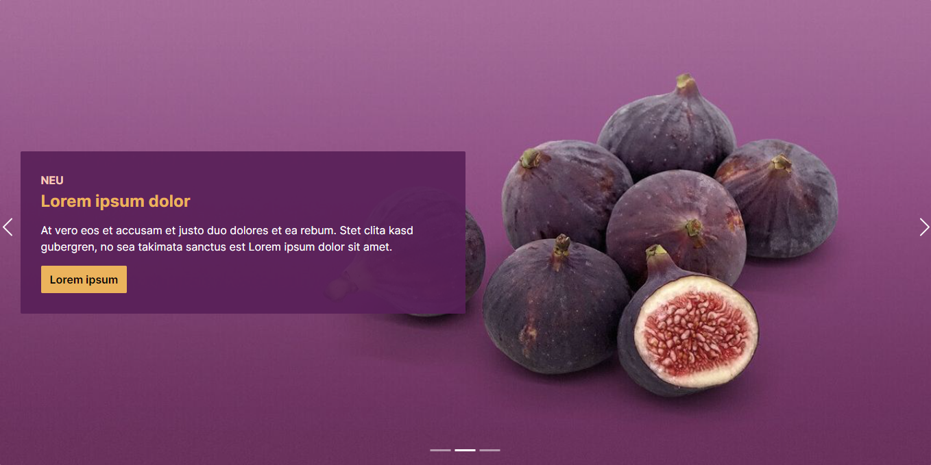
ThemeWare® "Call-to-Action slide (Hero slider)"
Configuring the ThemeWare® "Call-to-Action slide"
Elements of the "Call-to-Action slide"
Disply mode 'contain'
Disply mode 'cover'
Disply mode 'cover' in detail
Text below the image
Text overlays the image
Logo