
The ThemeWare® "Product description & reviews (Accordion)" is a variant of the Shopware element "Product description & reviews". The contents are displayed as an accordion or as a list. You can also show or hide individual sections.
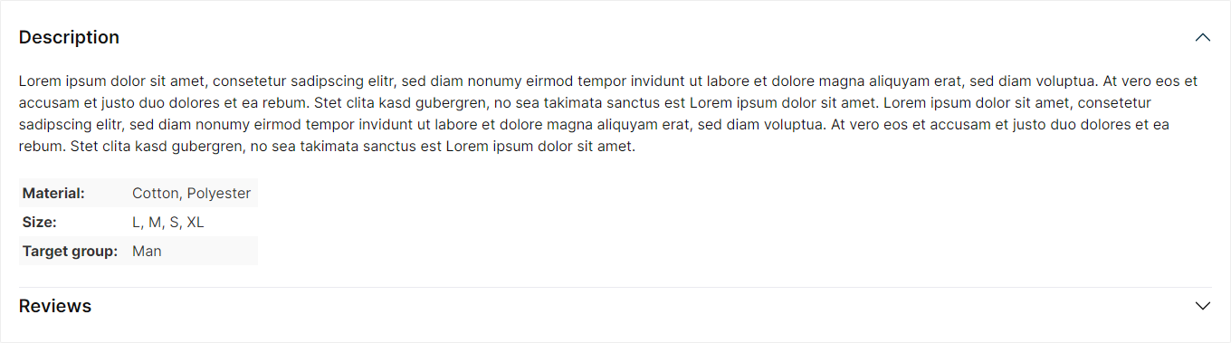
Product description & reviews (Accordion)
Beta: This feature is currently in beta and may change in a future release. – We'd love to hear your feedback.
Important: This element is only available in the ThemeWare® Pro Edition.
Configure element
You can configure the ThemeWare® "Product description & reviews (Accordion)" as follows:
- Click on the corresponding CMS block (1) to activate the "edit mode"
- Hover the mouse over the desired CMS element
- Click on the
 "gear" icon (2) to configure the CMS element
 - The "Element Settings" pop-up will open
- Make the desired changes
- Save your changes
You have now configured the CMS element.
Configuration
The configuration of the "Product description & reviews (Accordion)" is fairly self-explanatory. Basically, you only need to show or hide the desired sections.
General
In the "General" tab you configure the visible sections of the element.
Content
In the "Content" section you can specify which sections are displayed in the element:
- Show 'Description' section -- Displays the product description (default: show).
- Show 'Properties' section -- Displays the properties table as its own section (default: don't show). Requirement: the properties table is shown as its own tab in the theme configuration – otherwise it appears in the description (theme-controlled).
- Show 'Symbols' section -- Displays the "Product symbols" as their own section (default: don't show).
- Show 'Videos' section -- Displays the product videos (currently disabled).
- Show 'Datasheets' section -- Displays the datasheets (currently disabled).
- Show 'Custom content' section -- Displays the custom tab content (default: don't show).
- Show 'Manufacturer' section -- Displays the manufacturer information – the same content as in the manufacturer tab (default: don't show).
- Show 'Product safety (GPSR)' section -- Displays the GPSR details (manufacturer information and responsible person) (default: don't show).
- Show 'Reviews' section -- Displays the product reviews (default: show).
Tip: Where content such as properties, videos, datasheets, manufacturer and GPSR details is positioned – as its own tab/section or within the description – and many more settings are defined in the theme configuration.
Layout
In the "Layout" tab you can configure the display layout of the element.
General
In the "General" section you select the layout type: "Accordion" (default) or "List". Additional settings are available for the "Accordion" layout type:
- Accordion style -- Choose the style of the accordion headers: "Clean" (default) or "Buttons".
- Keep sections open -- Already opened sections stay open when another section is opened (default: off).
- Show as list on mobile -- On mobile devices, all sections are displayed open as a list (default: off).
Description
- Show headline -- Displays the headline of the description section (default: show).
- HTML tag -- Specifies the semantic heading level of the description title: paragraph (P tag) or h1 to h6 (default: h2). The visual appearance stays the same.
Product symbols
- Show headline -- Displays the headline of the symbols section (default: show).
Custom content
- Show headline -- Displays the headline of the section (default: show).
Manufacturer
- Show headline -- Displays the headline of the manufacturer section (default: show).
Product safety (GPSR)
- Show headline -- Displays the headline of the GPSR section (default: show).
Summary
Snippets
- Aria label
twt.cms.productDescriptionReviews.ariaLabel